Research case: Saint Mary's customer app
What I’ve learned from the best fake hospital in the world
I’m an obsessive person. I wish I was able to fast pace courses and build only what is being asked, but being this level of crazy, I tend to over deliver and go the extra mile in everything I do. That being said, this project was developed during one of the Google UX certification courses, but it ended up being so much more than a fake app for my portfolio! Thanks to this project, I learned a lot about our health system, and discovered that research is a real passion for me. TL;DR? Click here and skip to the presentation!
Some of the skills and frameworks I used
Empathy: it’s a cliché to talk about empathy when discussing UX Design, but it really had a major role in the process. In this project I finally understood the difference between daily empathy (essential for being a good human being), and the empathy we achieve through research.
Secondary research: I read a lot of academic material and official statistics about our health system (specially in the private sector). Through this research I was able to identify the major user pain points and the daily struggle of people with chronic conditions in Brazil, even those with health insurance.
Primary research: since this is a fake hospital, I interviewed people around me, and tried to gather a diverse group of participants. Equity is really important to me, so from the beginning it was clear that people who visits the hospital more often tend to suffer more, so our app should focus on this group of users. If this group is happy, everyone is happy!
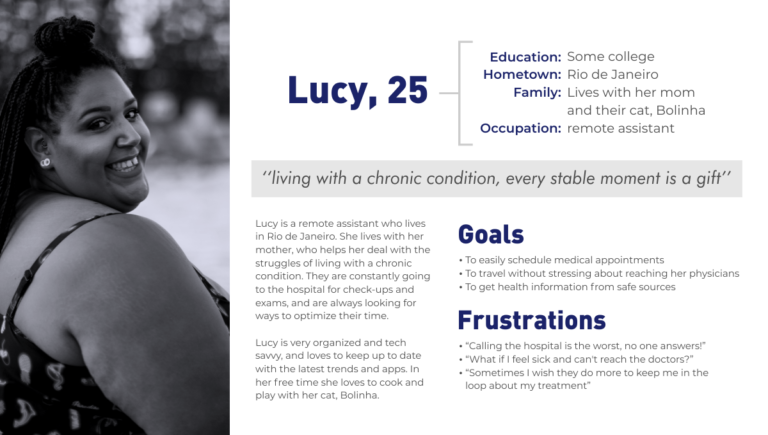
Personas: I love building personas, and even do this as a hobby (maybe it has something to do with the years of RPG games :P). For this project, I developed two personas, Lucy and Jorge. Their level of education and tech savviness is very different, as is their age and gender. They represent the major user group very well, and resonate real pain points and struggles of a vast group of users.
User stories and 5W1H: I was afraid of this stage, but since I had done a lot of research, it was easy to define the user stories! The persona really helps us to connect and feel empathy for our users, and the more thorough the research, the more information and insights we have in the end. I know not every product and user group is so easy to navigate and understand, and that the absurd intricacy of our health system’s problems really make the issues pop, but I do believe that extensive research can help in any case! The 5W1H framework was also really helpful.
User journey map: I love a good journey, and no proper quest is complete without a map! For this project, I built two journey maps, one for each persona. Scheduling appointments and getting exam’s results are the two most common journeys a regular hospital user goes through, so Lucy’s goal was to “talk to her doctor about her latest exams” and Jorge’s goal was to “schedule his first Wellness Program appointments”. It was amazing analyzing their journey and backing everything with real research!
HMW: the famous “how might we…”! At first I was skeptical, but it’s amazing how we can get creative and able to see the bigger picture when we write our questions the right way! I explored other frameworks for the same purpose (thanks, IDEO haha), but this simple tool was so amazing that I fell in love.
User flows and wireframes: it was really funny to explore the possibilities while also trying to keep everything as simple and straightforward as possible, since a large part of the users are elderly and not really tech savvy. While building user flows and some wireframes, I constantly reminded myself that I was not building something for myself, that I was not the user and that accessibility should be the top priority at all times. Sometimes what may seem simple for us is not simple for the next person.
I also used value propositions, goal statements and some other frameworks. I also attempted a solo design sprint, with post-its on the wall and all, and since I was doing everything alone, my husband was my peer in brainstorming sessions and other activities that demanded a team to work.
To guarantee that the hospital was fake but the research was real, I conducted a competitive audit and compared some hospitals and clinics in my neighborhood. I researched direct and indirect competitors, and learned a lot from their platforms and services, especially what not to do, since most of them were UX nightmares.
It was an amazing experience, and I hope you too can learn from the research behind Saint Mary’s! In the presentation you can check what I got so far (it’s an ongoing/passion project), and if you’re interested in reading the interviews, insights and competitive audit, please send me a message! They were too long to fit here! hehe
It was also amazing to work on Saint Mary’s brand. All photos were chosen with diversity in mind, and the balance between white, blue and gray gives the hospital a clean, reassuring and professional feel. Since it is a traditional neighborhood hospital runned by the church, I used simple fonts and symbols, trying not to be too edgy: there’s no use in a trendy UI if your user is a grandpa who only wants to schedule an appointment. On the other hand, if you don’t keep up with the best practices, you lose users like Lucy, who is young and tech savvy. It was a challenge finding the right balance and developing a brand identity that really works and tells the world that Saint Mary’s care!
If you fell in love with Saint Mary’s and want to team up and build the app, let’s talk! I strongly believe that hands on practice is the best way to learn! Apart from being a designer, I’m a JavaScript student, a CSS and HTML lover and a passionate lunatic who loves to build new things! <3